Rudimentary library statistics visualization in Python with Pandas and Matplotlib
Beginning in July 2019, I created a Google form with my colleague Jason Sanders to collect reference and use statistics for the BAMPFA Film Library. The form replaced decades of paper statistics forms that had to be manually tallied and parsed in order to report to various funders, administrators, and so on throughout the year (which got especially difficult when trying to separate July-June fiscal years from calendar years).
These statistics have of course been handy in reporting, but I just now found some time to do a bit of research on how to take advantage of this new, rich data set. Some obvious low-hanging fruit of course was visualization, getting a bird’s eye view of who we serve and what our patrons are working on. What follows is a quick overview of these first efforts. Here’s the GitHub repo where you can follow along and recreate these if you’d like (or give me tips on how to do it better!).
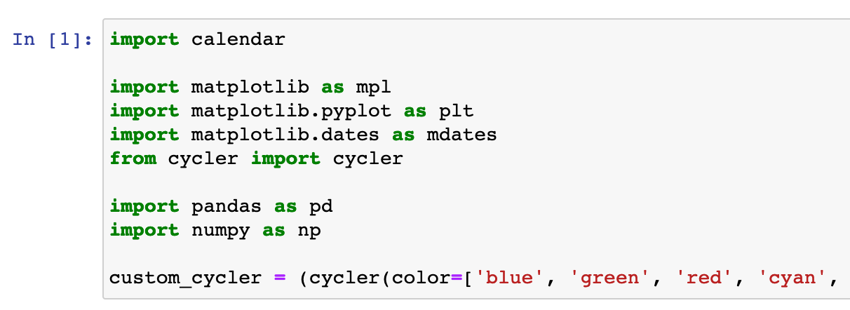 Importing libraries in the Jupyter notebook
I have been wanting to get a bit deeper into data visualization (only done some cursory fiddling around before) so this seemed like a natural venue for that. I knew from encountering visualization in Python before that the main tools I’d want to use were:
- Matplotlib
- To install it run
pip3 install matplotlib - This is an insanely powerful data analytics library that lets you do everything from the kind of basic plotting I show here to NYT-level data wizardry. There’s a huge community of people using matplotlib for lots of different purposes and it’s heavily used in teaching people about data science, all of which means that there is a ton of documentation and stackoverflow answers for basically any problem you can imagine (I mean that I can imagine). And the documentation on the library’s website is actually really good, unlike many other software libraries.
- It can work with many types of tabluar data, but it’s most popular with:
- To install it run
- Pandas
- To install it run
pip3 install pandas - This is another really deep tool that I only scratch the surface with. I’ve only ever used it to work with CSV-like data in what pandas calls a
DataFrame, essentially a spreadsheet held in memory that you can do all kinds of neat things with. It’s a lot easier than using the built-in Python CSV tools for certain uses in large part because it has lots of auto-magic functions to do common tasks like find a cell by its x/y coordinates and calculate the mean of a column (although sometimes the transparency of the standard librarycsvmodule makes it simpler to do quick and dirty CSV manipulation). - When you install pandas it also installs
numpyfor you, which does a lot of… math things. Again, it has built-in functions to do common data-science-y things so you don’t have to spell out these functions using the Python standard library.
- To install it run
- Jupyter
- To install it run
pip3 install jupyterlab - Another super powerful tool that I just do simple things with. This tool kinda-sorta runs a mini-virtual environment in your web browser where you can run the centerpiece of the Jupyter world, the Jupyter
notebook. With a Jupyter notebook you can draft Python code and test it on the fly (instead of having to use the console, for example, which gets annoying). It also lets you do things like print out plots and charts inline! So you run the code and you get a nice preview of what your chart will look like right there. Neat!
- To install it run
Wait what do I want to plot?
 Pandas makes it super easy to get data from a CSV
The data is read from our CSV (created by the Google Form) by Pandas as a DataFrame basically automatically. There’s also a ton of built-in date magic that you can see above (here I’m converting the text timestamp from Google into a machine-readable datetime object).
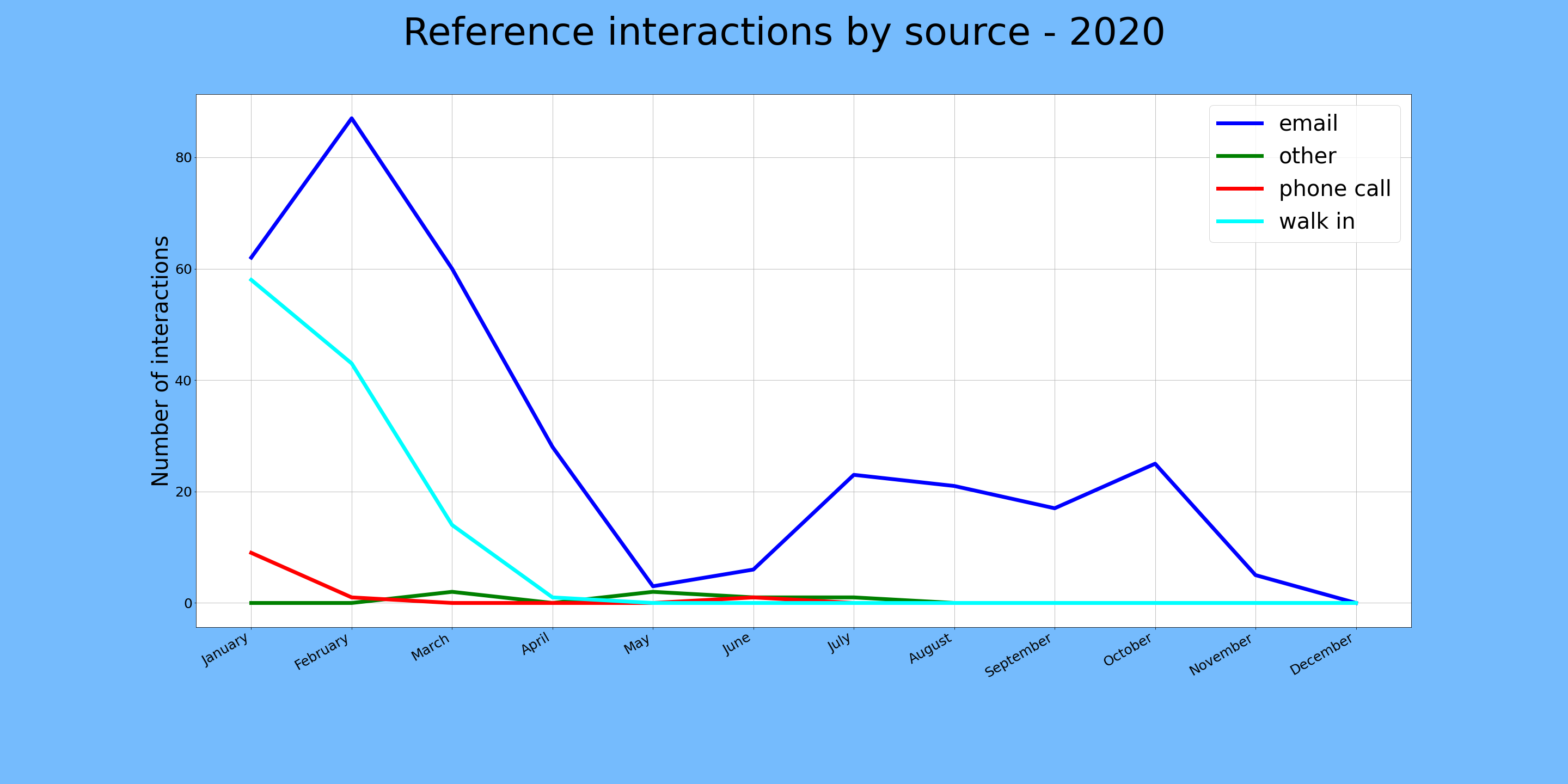
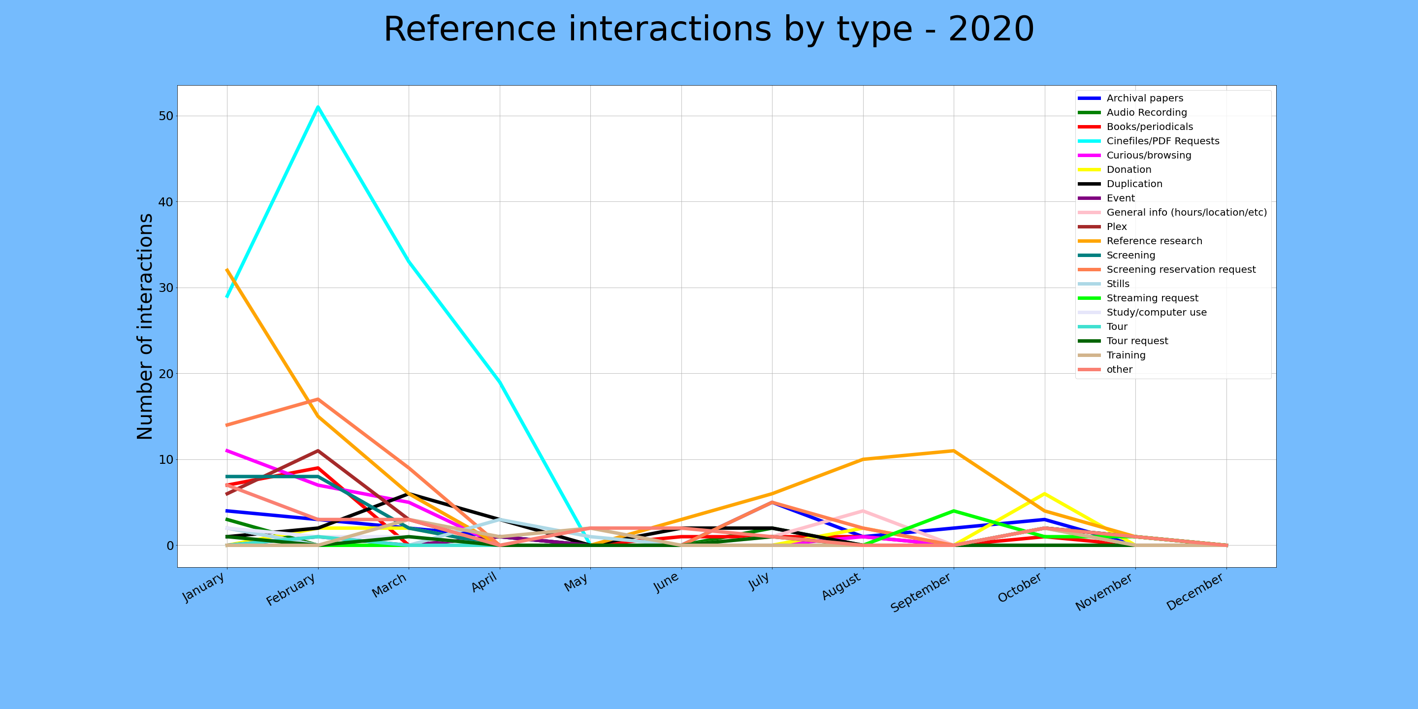
The conceptually difficult thing for me at this point was to figure out what I actually wanted to know from our data. The easiest points to measure were the origins of each reference interaction, and the category for each interaction, both measured over time. The great thing here is that we use controlled lists for these two categories and the timestamps are automatically entered by Google, so the data is pretty clean.
 Gettin' there.
It was simple enough to isolate the columns of interest (“Interactions by source”, “Interactions by type”, and “Timestamp”), then plot them using one of the many examples available online, but it took a little tinkering to realize that it would be more useful to plot monthly tallies instead of single data points per day, which might be spread over arbitrary stretches of time. To get these tallies, I just isolated the rows with a given month in the epoch column, then counted how many times a given value occurs. For example: email as interaction source during 2020-05. This was made so much easier by working with built-in date functions in Pandas.
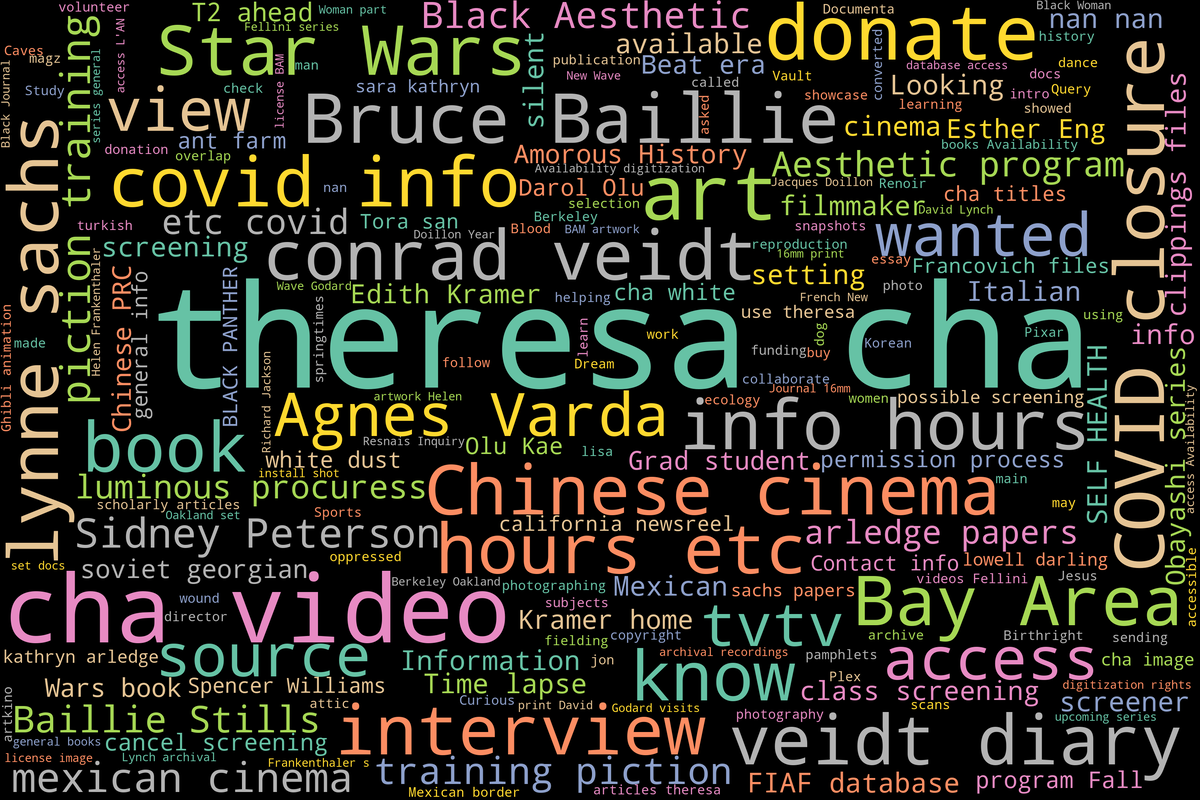
Word salad cloud.
Next up I thought it would be useful to take our free-text “Reference need” column and see what patterns emerge. Luckily (a.k.a. with some foresight) I have tried to keep things like names entered as consistently as possible, especially ones that I knew would be common like “Theresa Hak Kyung Cha.” She (not surprisingly) appeared as one of our main topics of interest, as her work is among the most researched in the institution’s collections.
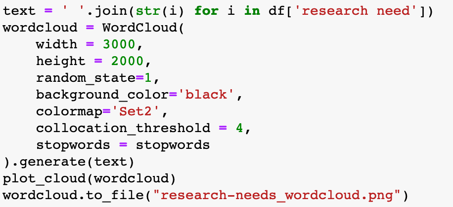 So simple
The code that I used to create the wordcloud at the top of this post was shockingly brief, thanks to a Python library called…. wordcloud that is designed to make these based on text corpuses (corpi?). It looks longer above because I added some line breaks in the WordCloud function, but it’s really just 4 lines of code, plus a couple setting up the stopwords above this. Figuring out what extra words needed to be added to the stopword list was actually the most time consuming part, since I had to run it a few times to pick out words that were not of interest. There are also some settings like collocation_threshold that can be tweaked to sort of get at additional phrases instead of single words.
Next steps
Which brings me to the next steps I’d like to take, at least with the wordcloud. Data scientists use much more in-depth Python library called nltk (for “natural language toolkit”) for textual analysis and really powerful language analysis. Among many other things this allows much finer control over how words in a body of text are “tokenized” (a.k.a. broken down into discrete chunks as single words or as n-length chunks).
Looking at the wordcloud above I can tell right away that it isn’t all that accurate, or at least that there are some things that are opaque in how it assigns sizes. For example “Star Wars” occurs the same number of times as “Sara Kathryn Arledge” in our reference needs column, but Star Wars gets much more prominent placement. Tweaking the collocation_threshold produced fairly similar results every time, so I’m not sure what’s going on. I think that using nltk to produce a visualization that is more transparent to me would probably be good in terms of accuracy, but the auto-magically slick wordcloud version is hard to beat.
In terms of our other stats, I’ll be refining the aesthetics of the charts produced here and hopefully get some feedback from colleagues about what is helpful and what isn’t. Let me know if you have any ideas!